
Poolr
Overview: UX Case Study | Google UX Design Certificate
This app and website were designed to simplify collaborative saving by helping friends and family work toward shared financial goals in a transparent and organized way. The platform enables users to create group savings plans, track contributions, and monitor progress in real time, reducing confusion and making shared budgeting a more positive, accountable, and stress-free experience.
Role:
Conducted user research and designed the end-to-end user experience prior to development.(October 2025 - June 2026)
Responsibilities:
User Research, Personas, User Flows, Information Architecture, Wireframing, Prototyping, Usability Testing, Visual Design
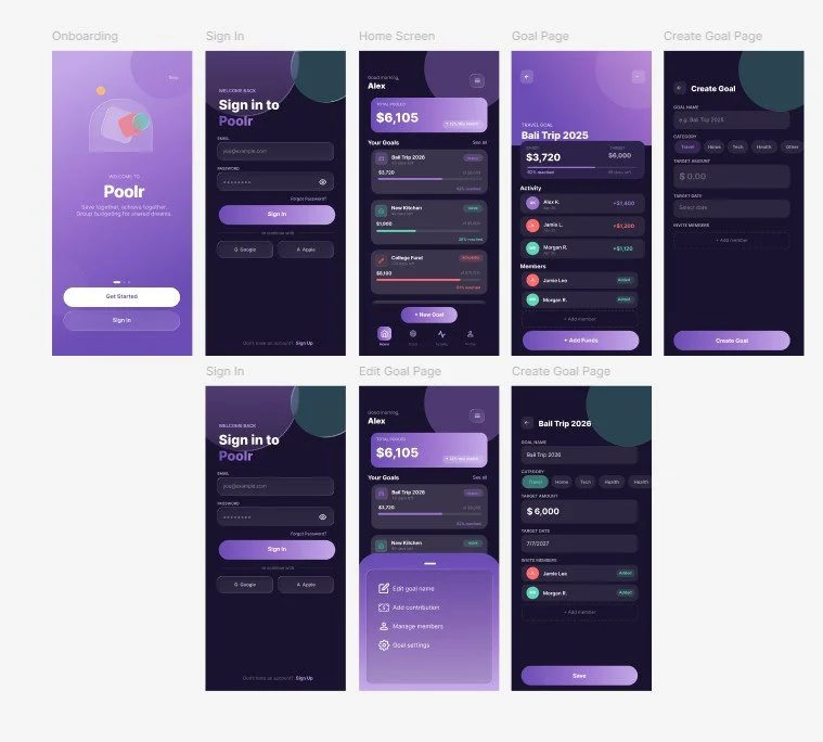
The Problem
People saving toward a shared goal often struggle with:
Unclear contribution expectations
Forgetting payments or deadlines
Scattered communication across multiple platforms
Financial conversations feeling awkward or stressful
Existing budgeting tools focus primarily on individual users and fail to support the collaborative nature of shared financial planning.
The Goal
Design a solution that helps groups:
Create shared savings goals
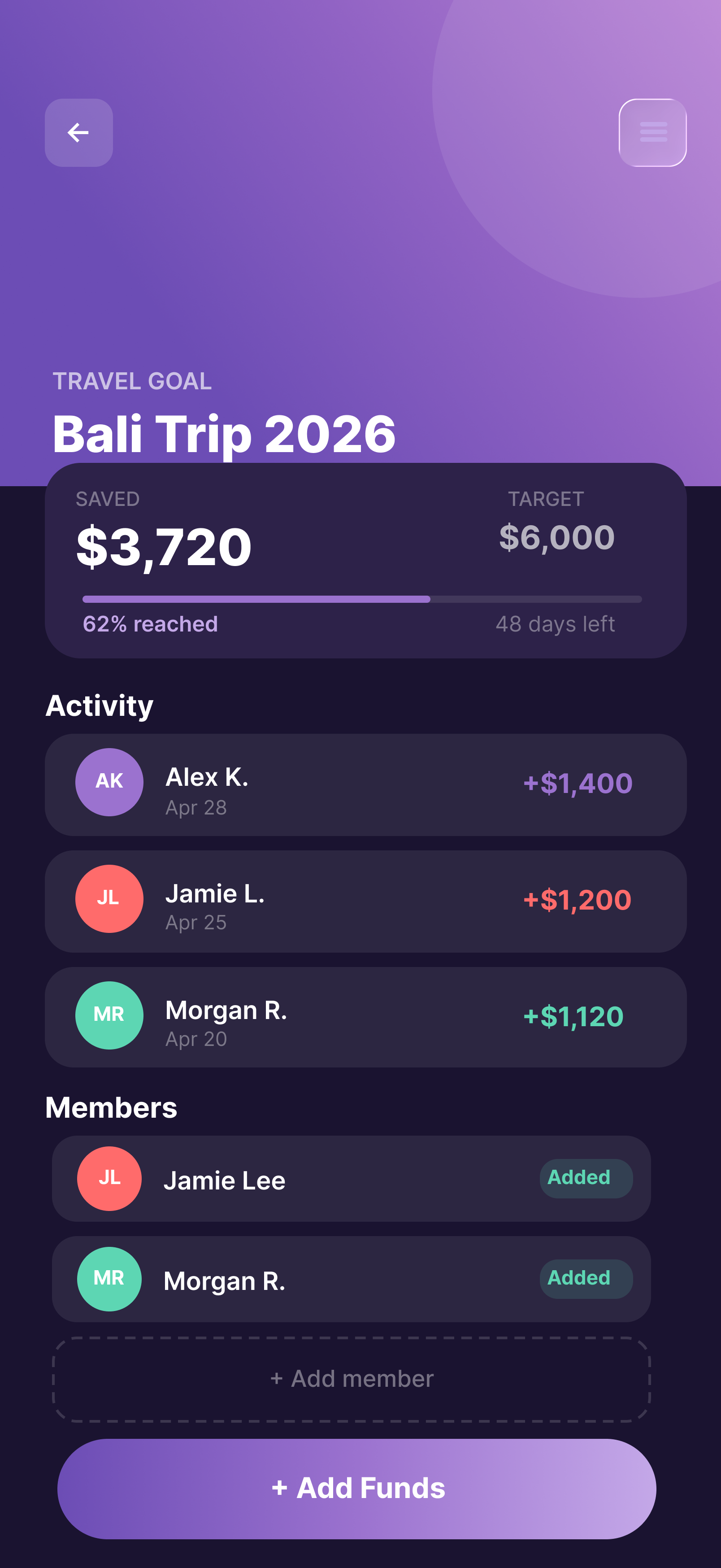
Track contributions transparently
Stay Motivated through visual progress tracking
Reduce stress surrounding money conversations
Research
Research Method: I conducted qualitative interviews with individuals who regularly manage finances with partners, friends, or family members.
Key Insights: My initial assumption was that users mainly struggle with calculations and expense tracking. However, research revealed that expense tracking and accountability were bigger challenges. Shifted design focus toward: transparency & progress visibility.
Personas
Research identified three primary user types who manage shared financial goals:
Shayla – A frequent traveler who wants clear communication and visibility when saving with friends and her partner.
Jack – A busy entrepreneur who needs reminders and an effortless way to stay on track with family savings goals.
Michelle – A parent planning family travel who needs flexibility to manage multiple savings goals, including accessibility-related expenses.
Defining The Solution & User Journey
Based on user research, I designed a collaborative budgeting platform that helps friends and families create shared savings goals, track contributions, and stay aligned throughout the saving process. The solution focuses on improving transparency, accountability, and communication while reducing the stress often associated with managing money together.
Users begin by creating a shared savings goal, inviting participants, and setting contribution expectations. They can then track progress, communicate with group members, and receive reminders, helping everyone stay engaged and work toward a common goal successfully.
Wireframes
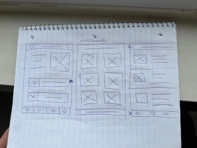
I began with paper sketches to rapidly test different layouts and feature priorities.
Key focus:
Visibility of savings goals
Easy access to creating new goals
Clear navigation
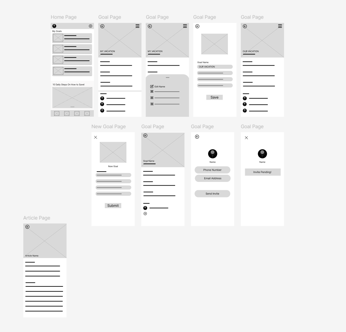
Digital Wireframes
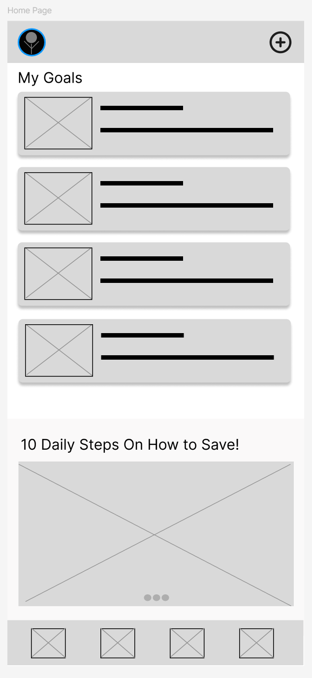
The homepage was designed around the most important user need:
Seeing goal progress immediately.
Design decisions included:
Goal dashboard as the primary focus
Quick access to creating new goals
Visual progress indicators
Usability Testing
Round 1 Findings
User want a clearer New Goal Button
User wants a more clickable hamburger menu
Users want more complete prototype
Iterations
Problem
User want a clearer New Goal Button
Solution
Refined the layout to improve readability and comprehension.
Usability Testing
Round 2 Findings
Users wanted multiple ways to complete actions.
Based on some design features a user expects a specific action (i.e. exiting from a slide-in feature by tapping on the screen behind it)
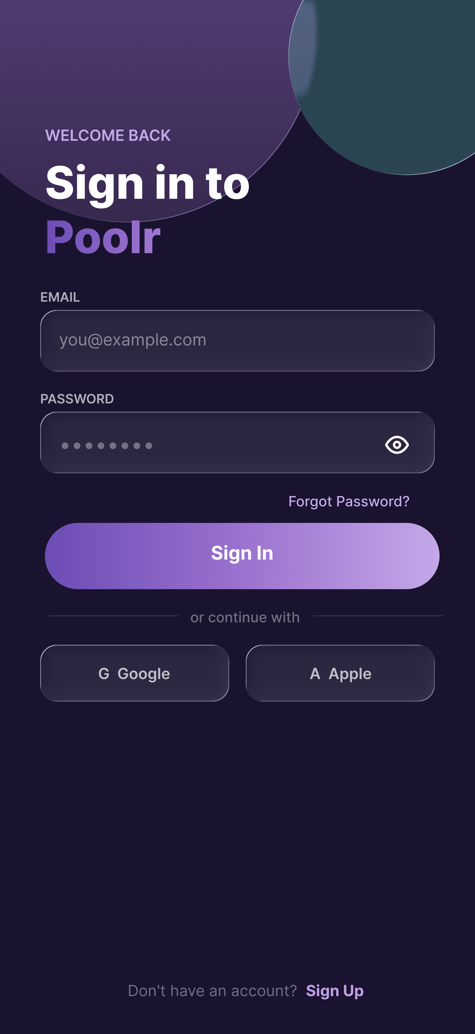
Being able to input information is an important step to the user flow
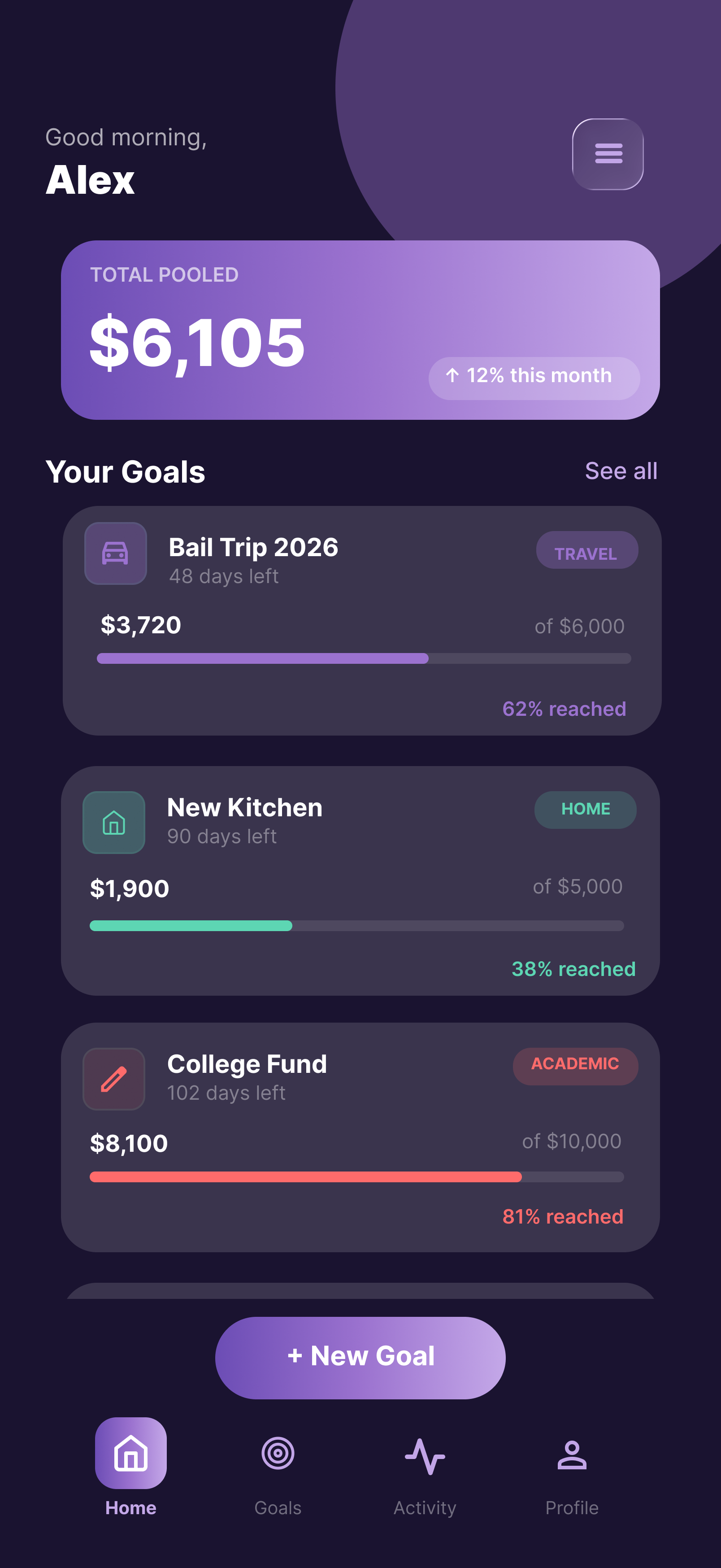
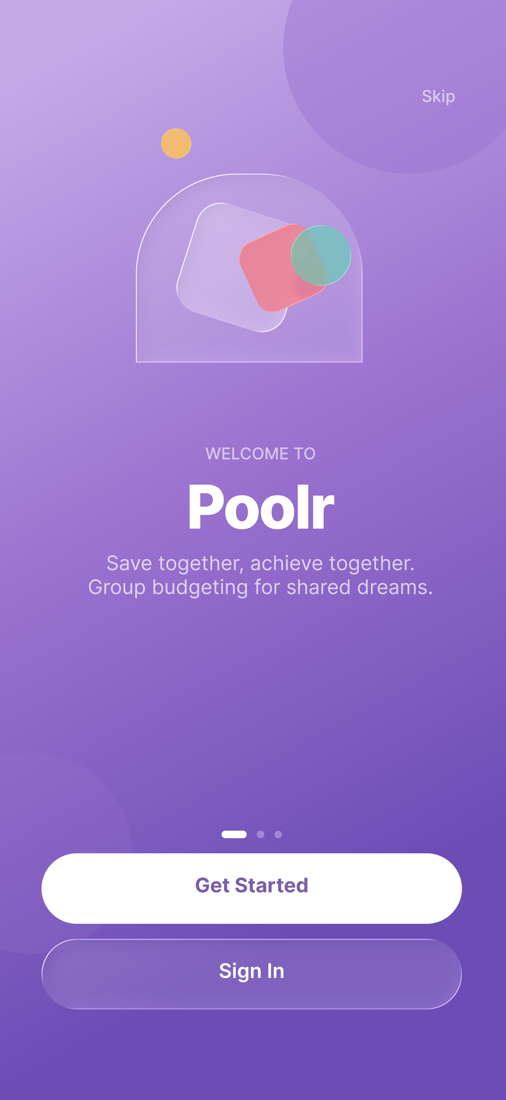
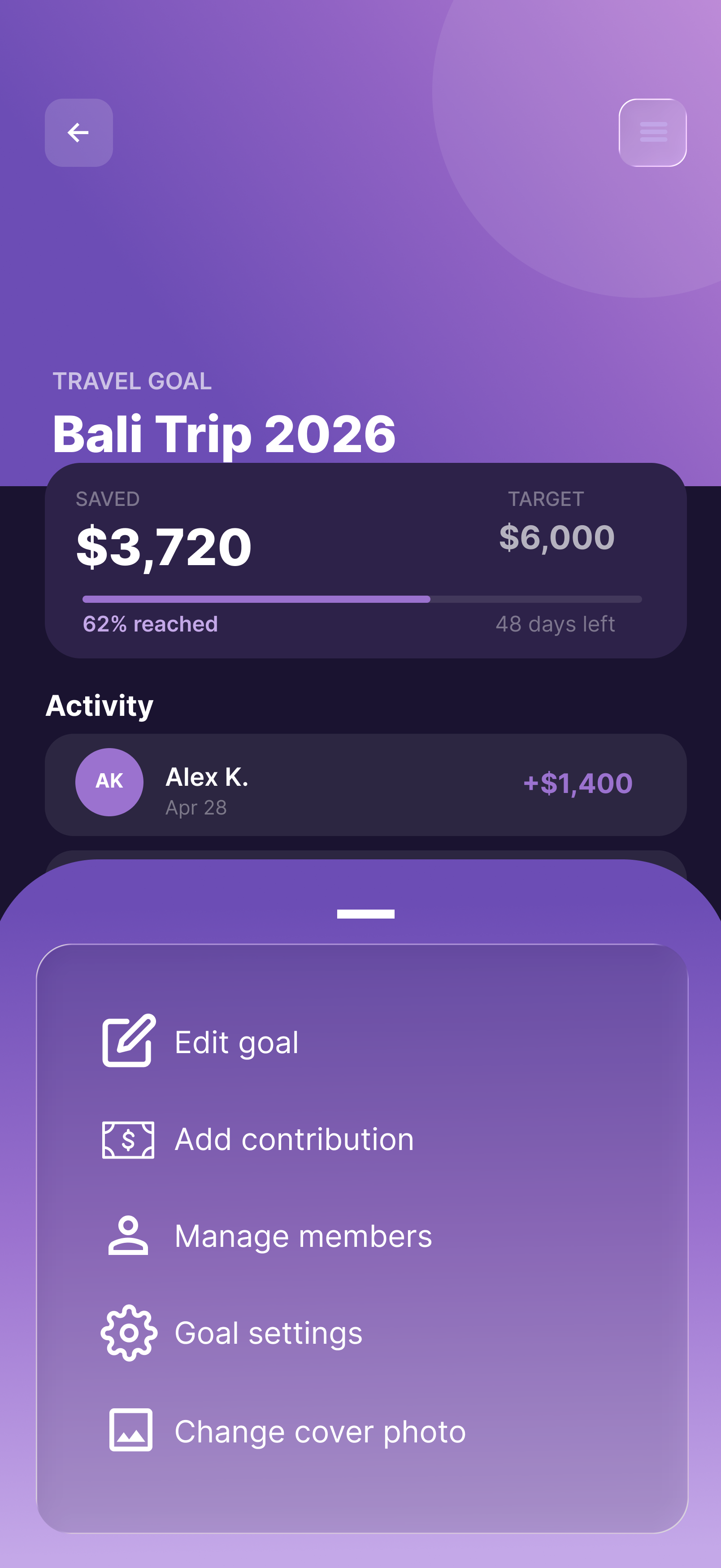
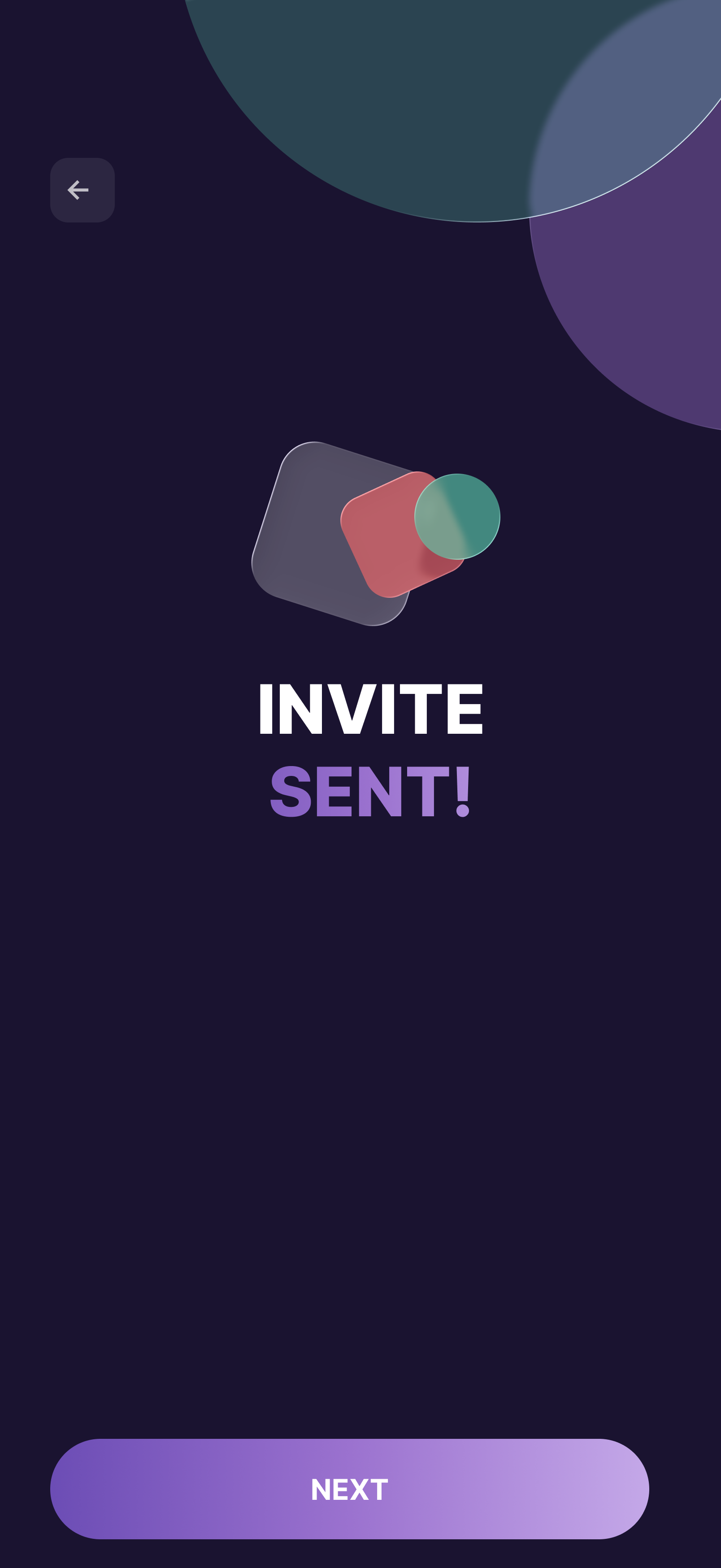
Final Design | High-Fidelity
Accessibility Considerations
I provided alternative options to using gestures and gave users multiple ways to complete an action
I thought critically about the speed and durations of the motion in my designs
Used colors that were vibrant and high contrast to make it easier for the user to see